| |
Business Case: the Client is a market leader in medical emergency simulators, developing and updating a considerably large array of devices, simulators, hardware’s and software’s. Numerous software’s come with numerous UIs to serve different propositions running on different devices and in different formats.
Design challenge: envision and demonstrate a UI able to unify on a single touch-point a large number of inconsistent product software’s. Imagine each of these software’s as a module that the customer can purchase on an apps store. Make sure that the experience stays balanced and seamless regardless the amount of modules purchased, by applying scalability and modularity. Demonstrate the progressive results through a highly interactive prototype.
1. I invested the first days in meeting the designers, the R&D people and the stakeholders involved in the creation and maintenance of the software’s. Because this was my first time working for a Norwegian company, I wanted to get familiar with the local culture and the local way of working, before I would actually start providing advice. Also, I wanted to make myself available and reachable, as well as explain my role to the colleagues that were less familiar with design process.
2. The introductory period gave me a chance to see, touch and try some of the software’s and simulators. I also had a chance to watch videos of live simulation sessions with actual students/trainees, how the experience evolves around the UI touch-points. I discussed with stakeholders about what are the known critical or weak aspects of the current system.
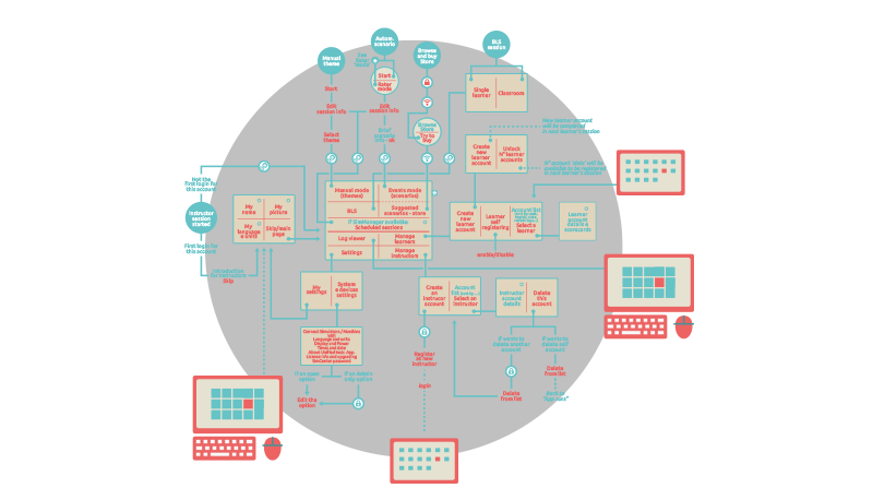
3. I analyzed the existing design documentation and recognized that it did not provide a thorough picture of the existing products. So I also collected screenshots from the running software’s directly, with the awareness that I will not be able to cover the entire scenario of existing cases, because too wide and not always accessible to me.
4. I decided to set a time limit to the collection of screens and cases, preferring to acknowledge that the work shall not be approached on purely analytical approach. Creative intuition and agility will be filling the gaps, while frequent iterations with designers, devs and stakeholders will adjust the direction along the way. This approach was discussed with the design lead and agreed with enthusiasm, and revealed to be successful.
5. I started working on the layout. Realizing that this layout will have to adapt to a large variety of conditions and states, I considered it as a liquid layout. For this reason I understood that presenting sketches and static wireframes would not have been be ideal, in particular considering the colleagues that are less used to interact with the designer’s work. So I produced videos of dynamic wireframes that would actually show how the layouts would morph. This allowed the teams to understand the dynamics, figure out the intentions and provide me back with early valuable impressions, feedback and requests.
6. The selection made upon the videos gave me a solid input to start the development of an interacting prototype. For the first releases I focused exclusively on a wireframe level of detail, concentrating on how the modules would stage in the screen, how this would respond to user command, and how much responsiveness should predict the user needs, at a macro level of detail. I considered this the most important phase, on which the foundation of the UI would be constructed.
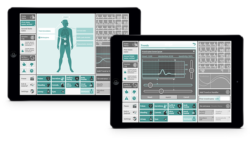
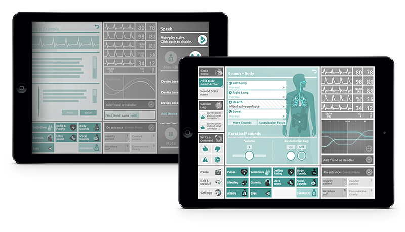
7. Alongside with the consolidation of the interactive layout, I started introducing graphic elements and details to it. The graphic design (as in styling) was out of my scope for this project, but of course some level oof detail is necessary to fully understand a UI proposal. So I opted for a neutral mockup style and coloring, and I utilized icons from an icon library I had previously designed for the same Client.
8. Throughout each of these these phases I was able to run the consecutive releases of the prototype on both desktop screens and tabled devices, with a considerable agility. This allowed colleagues and stakeholders to try and figure out the UI in different conditions, so they could help me with extensive feedback that I could inject back in the design in time for final release of the prototype.
The perceived added value at end of project is not only the final prototype as a tangible result per se, but also the whole process of frequent touch-basing of many people around a quickly evolving interactive object. This nurtures collaboration and releases creative potential from each person invoved, regardless their specific standpoints and perspectives on the process.
|
|